Imagine this scenario, you are working on a web development project, maybe they're using "insert trending CSS framework here", and you just want to try out some simple cool new "glitch" effect on the User's profile. So you decided: "Ok, let's spin up a simple starter page to try out this new feature". You clone a starter repository with everything you need, but wait... do you really need everything? How about we just simply copy-paste a 4Kb file to style.css and start developing that new feature!
CSS Variables
Yes! you can use variables in CSS without using a pre-processor like SASS and LESS. It is very simple and if you want to learn more about them I'd recommend the Mozilla reference guide on CSS variables. For now our variables will be very simple, let's start with our breakpoints.
/* Variables */

:root {
  /* Breakpoints */
  --mobile: 576px;
  --tablet: 768px;
  --desktop: 992px;
  --desktop-lg: 1200px;
}We also need to configure our grid system, the number of columns, the gutter size (space between columns), types of columns and their minimal widths. For now let's add the columns and the gutter to the root's variables.
/* Variables */

:root {
  /* Breakpoints */
  --mobile: 576px;
  --tablet: 768px;
  --desktop: 992px;
  --desktop-lg: 1200px;
  /* Grid Config */
  --grid-columns: 12;
  --grid-gutter: 15px;
}Container
The container or sometimes called wrapper is our fundamental block, this is the place where all the rows and columns will live. In our simple implementation, we only need to define the horizontal padding, that is the left and right padding.
.container {
  width: 100%;
  padding-left: var(--grid-gutter);
  padding-right: var(--grid-gutter);
  margin-left: auto;
  margin-right: auto;
}Responsive Containers
For a more "modern" approach to our containers, we will set our containers to a different maximum width depending on the device's screen minimum width. To achieve this, we need to make use of media queries, which are useful when you want to modify your site depending on a device's specific characteristics such as screen resolution or browser viewport width. You can read more about this on the Mozilla reference guide on media queries.
/* Responsive Containers */

@media (min-width: 576px) {
  .container {
    max-width: 540px;
  }
}

@media (min-width: 768px) {
  .container {
    max-width: 720px;
  }
}

@media (min-width: 992px) {
  .container {
    max-width: 960px;
  }
}

@media (min-width: 1200px) {
  .container {
    max-width: 1140px;
  }
}Rows
The rows will be a bit more complex, it will use the CSS Grid Layout System which is a 2D grid-based layout system. According to CSS Tricks, as of March 2017 all mayor browsers support this CSS feature including Android and IOS.
.row {
  display: grid;
  grid-template-columns: repeat(var(--grid-columns), 1fr);
  grid-gap: var(--grid-gutter);
  padding-top: .2em;
  padding-bottom: .2em;
}

.row>* {
  box-sizing: border-box;
  flex-shrink: 0;
  width: 100%;
  max-width: 100%;
}

/* Hide something */
.d-none {
  display: none !important;
}Columns
This bit of our simple grid layout is pretty straightforward although a bit repetitive since we are not using a pre-processor like SASS or LESS. The idea is to define the positioning and padding of our columns then apply through media queries the responsive behavior.
/* -- Columns -- */

.col-sm-1,.col-sm-2,.col-sm-3,.col-sm-4,.col-sm-5,.col-sm-6,.col-sm-7,.col-sm-8,.col-sm-9,.col-sm-10,.col-sm-11,.col-sm-12,.col-sm,
.col-md-1,.col-md-2,.col-md-3,.col-md-4,.col-md-5,.col-md-6,.col-md-7,.col-md-8,.col-md-9,.col-md-10,.col-md-11,.col-md-12,.col-md,
.col-lg-1,.col-lg-2,.col-lg-3,.col-lg-4,.col-lg-5,.col-lg-6,.col-lg-7,.col-lg-8,.col-lg-9,.col-lg-10,.col-lg-11,.col-lg-12,.col-lg,
.col-xl-1,.col-xl-2,.col-xl-3,.col-xl-4,.col-xl-5,.col-xl-6,.col-xl-7,.col-xl-8,.col-xl-9,.col-xl-10,.col-xl-11,.col-xl-12,.col-xl,
.col {
  max-width: 100%;
  position: relative;
  padding-right: var(--grid-gutter);
  padding-left: var(--grid-gutter);
}Responsive Columns
With our columns defined, now we need to define the behavior depending on the media query. As an example I will write and explain the first types of columns which are the col-sm-* for the small media query.
/* SM */

@media (min-width: 576px) {
  .col-sm-1 {
    grid-column: span 1;
  }
  .col-sm-2 {
    grid-column: span 2;
  }
  .col-sm-3 {
    grid-column: span 3;
  }
  .col-sm-4 {
    grid-column: span 4;
  }
  .col-sm-5 {
    grid-column: span 5;
  }
  .col-sm-6 {
    grid-column: span 6;
  }
  .col-sm-7 {
    grid-column: span 7;
  }
  .col-sm-8 {
    grid-column: span 8;
  }
  .col-sm-9 {
    grid-column: span 9;
  }
  .col-sm-10 {
    grid-column: span 10;
  }
  .col-sm-11 {
    grid-column: span 11;
  }
  .col-sm-12 {
    grid-column: span 12;
  }
}
The idea here is to span the column count by 1 until we get to the 12th column. Now we need to do this to all the types of columns and media queries we're going to use, but for simplicity sake I've already written it down for you!
Example
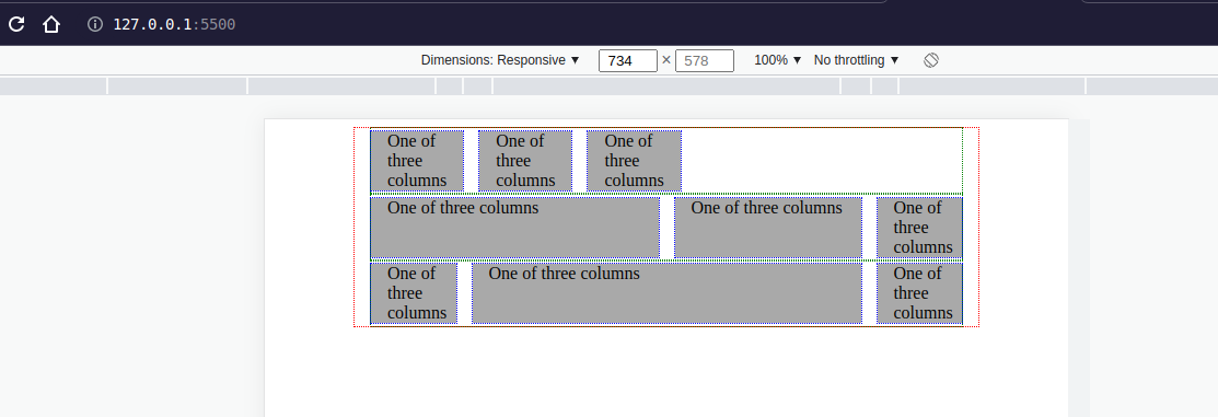
Just copy-paste the whole thing to a grid.css named file and reference it from your html like this.
<!DOCTYPE html>
<html lang="en">

<head>
  <meta charset="UTF-8">
  <meta http-equiv="X-UA-Compatible" content="IE=edge">
  <meta name="viewport" content="width=device-width, initial-scale=1.0">
  <title>Vanilla CSS Grid Inspride by bootstrap</title>
  <link rel="stylesheet" href="grid.css">

</head>

<body>
  <div class="container">
    <div class="row">
      <div class="col-xl-6">One of three columns</div>
      <div class="col-xl-4">One of three columns</div>
      <div class="col">One of three columns</div>
    </div>
    <div class="row">
      <div class="col-sm-6 col-md-6 col-lg-6 col-xl-6">One of three columns</div>
      <div class="col-sm-4 col-md-4 col-lg-4 col-xl-4">One of three columns</div>
      <div class="col-sm-2 col-md-2 col-lg-2 col-xl-2">One of three columns</div>
    </div>
    <div class="row">
      <div class="col-sm-2 col-md-2 col-lg-2 col-xl-2">One of three columns</div>
      <div class="col-sm-8 col-md-8 col-lg-8 col-xl-8">One of three columns</div>
      <div class="col-sm-2 col-md-2 col-lg-2 col-xl-2">One of three columns</div>
    </div>
  </div>
</body>

</html>And here you can see the grid. (I added a dotted outline so you can see the different blocks of the grid layout)

The whole thing
Conclusion
I'm too lazy to get the extracted grid layout system from bootstrap or to run NPM and install another library, I just wanted a simple solution to test things out quickly and with less of a hassle than the other alternatives. So now, all I have to do is copy paste the file above. Hope you like it! Please tell me if you would like to add something or remove something to it.
Cheers! 🍻
References


